Club Wyndham
Project Summary
To redesign the Club Wyndham experience, one of more than 20 brands in the Wyndham Destinations premier portfolio. Club Wyndham empowers over 500,000 timeshare owner families to live their bucket lists. The club offers 100 resorts and 14,000 vacation suites across North America, from the busy streets of the Big Apple to the calming shores of Hawaii.
The design phase engagements with the Voyager Program consist of these two projects.
CUI: The owner-facing portal ( I focus on this project)
CUI will provide customers with a 24/7, user-friendly online experience to manage their account, search availability, book reservations, and learn how to make the most of their ownership.
TRIP: the Agent Desktop system for internal employees
TRIP will streamline the process for WVO’s agents to provide exceptional customer service to owners to ultimately get them on vacation and using their membership.
Project Background
Challenges
Club Wyndham had many challenges. One of the many issues was that it was a dying industry with an older demographic. With the redesign deployment, the company was also undergoing product restructuring to become competitive with new vacation rental disruptors. It had a legacy website built with technology that no longer can support new capabilities could features.
Duration
2015 - 2017
Team
Creative Director: Brian Barenio
Experience Director: Vincent Au
Senior Director: Vanessa Paulino
Product Manager: Rebecca Pustizzi
Role
Mid-fidelity Prototype | Visual design | Testing | Deployment |
Tools Used
Photoshop | Illustrator | Keynotes | Word Doc
Basecamp | Teams | Outlook
Product Overview
-
Current Product
High Purchase Price
Life Financial Commitment
Complex Product Rules
Heavy Regulations
-
New Product
Mid Level Purchase Price
Short Term
Ease of Use
Credibility Transparency
Strongly Branded Travel Club
Started from the bottom.
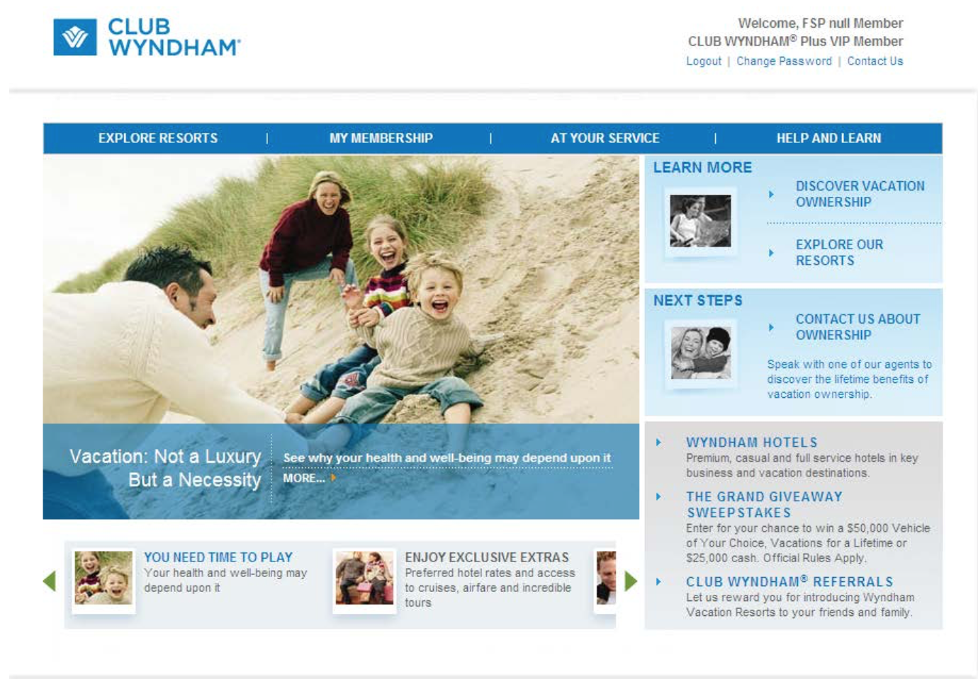
This was the previous Wyndham’s owner-facing portal to explore resorts, book reservations, view membership, learn about ownership. The previous website was a design that did not bring confidence to its consumers. It lacked credibility and transparency. The product was difficult to understand and the website was hard to navigate.
Objectives
Lower Cost with High Value
Simple & Flexiable
Implement New Technology
(Speed to Market)
Lower Commitment
Broaden Consumer Audiences
No Timeshare Regulations

Gaining Insights about the Industry
Research
Research travel competitors and other landscapes with loyalty and points redemptions. Review all documentation relating to Wyndham's completed research and develop a gap analysis with additional research to help drive engagement.
Communication
Meet with additional business units, such as marketing, to understand plans for deploying a new branding & design guidelines .
Workshops
Review Wyndham’s platform and participate in the capabilities workshops to fully understand what can be rollout, customized, and featured on the new site.
Test
The UX team created A/B wires to be tested. After the post-Launch Wyndham provided analytics, that I used in order to provide recommendations on how to further optimize the experience.
Now we are here
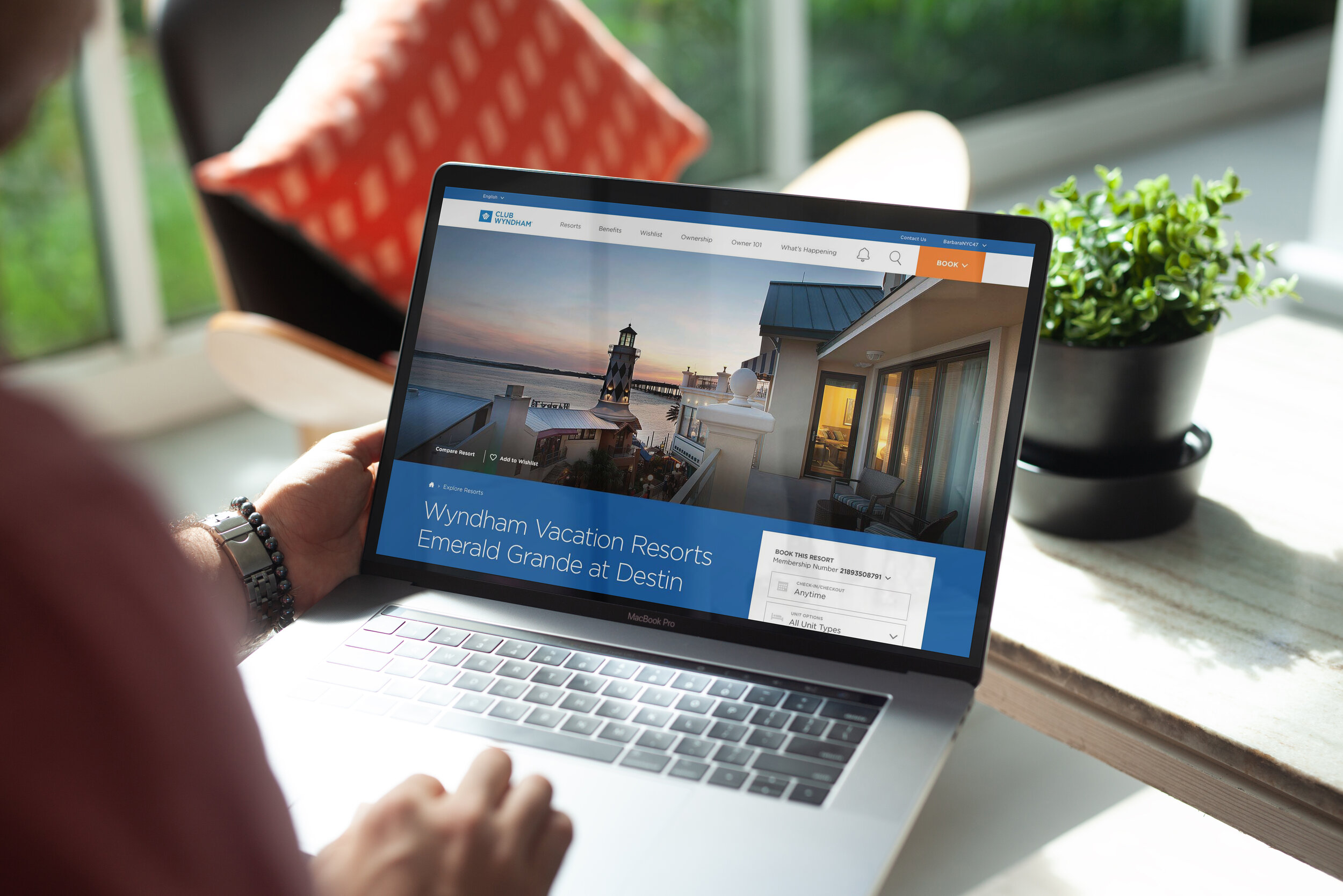
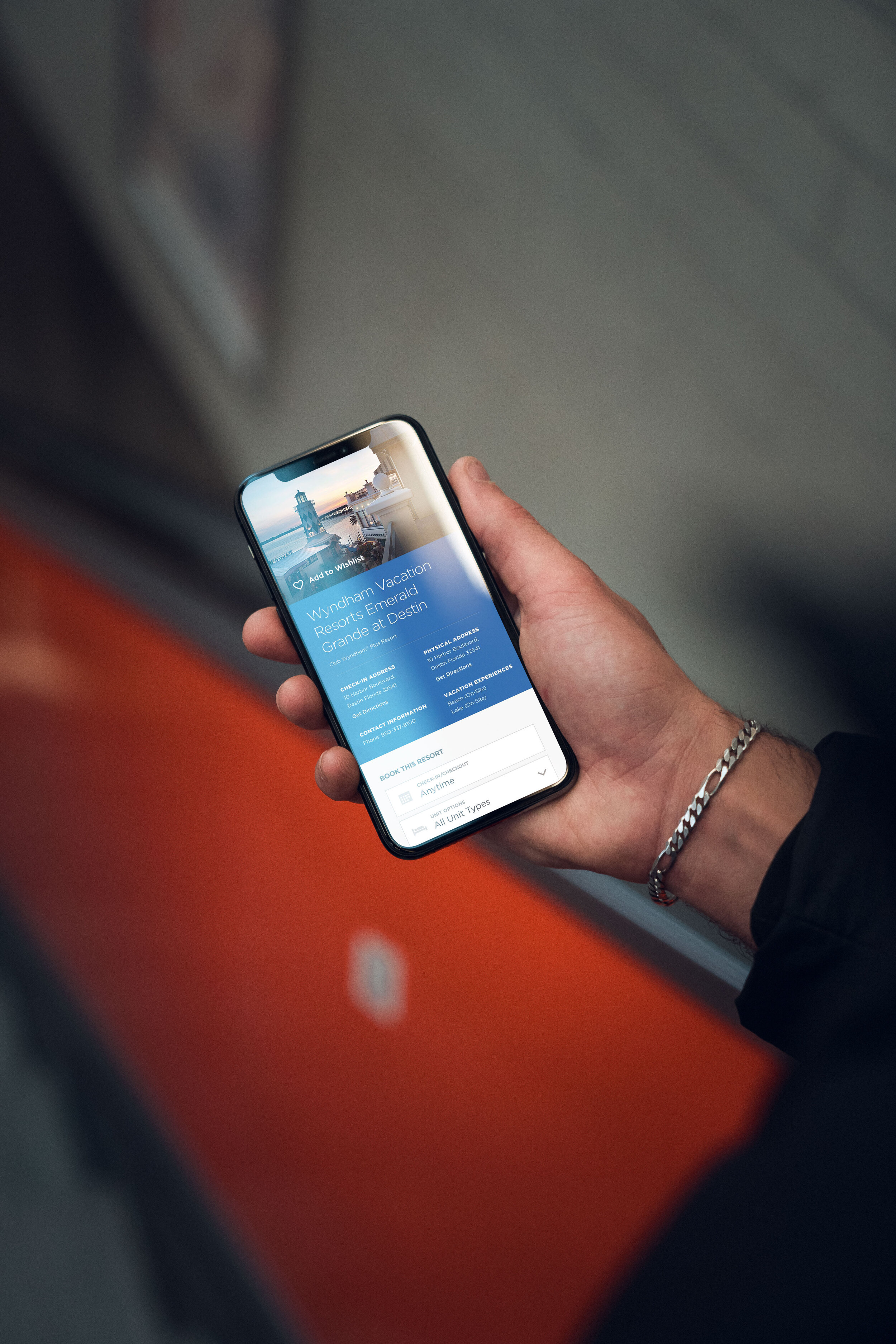
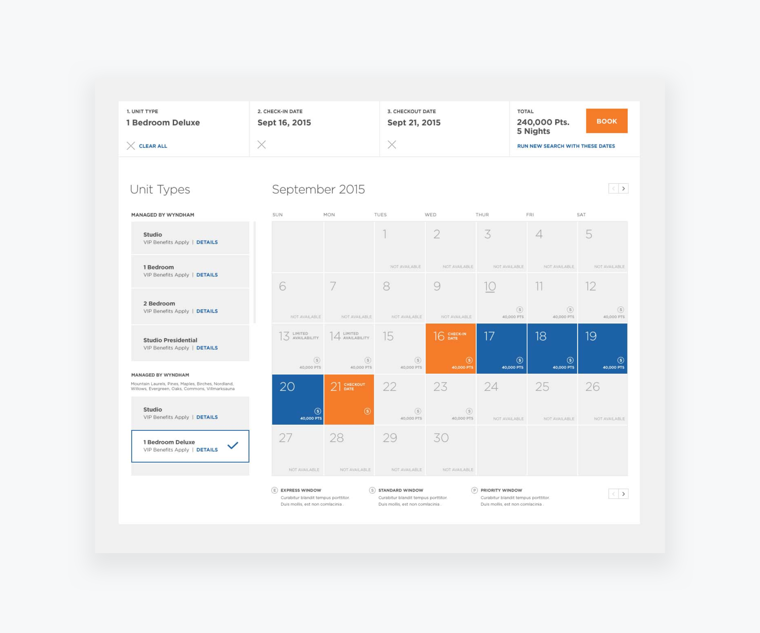
A new branding moment
The site and business strategy required a new overhaul. The UX and design team introduced new visual branding solutions to make the product transparent and accessible to existing and appealing to younger consumers. The team achieved this by first creating a mobile responsive site. We requested higher-quality imagery to represent Club Wyndham's portfolio properties. The previous product only allowed the user to check the availabilities of the properties. With the new rollout, our team was able to introduce new features, such as the ability to manage personal accounts, search availability, and book reservations all online.


