The American Express Travel
Homepage Redesign

Project Background
To elevate the American Express homepage by redesigning it with the OneAmex branding and globalize the page for the international markets to leverage.
Challenges
Limited space above the folds due to the booking widget being the most important and prominent component on the page. Numerous complex products rolling out at the same time as the homepage was getting re-design. Additionally, accommodating merchandising space for various stakeholders/markets in a landscaped with an established hierarchy.
Duration
Feb 2021 - Nov 2021
Tools Used
Photoshop | Sketch | Invision | Illustrator | Keynotes | Word Doc
Basecamp | Teams | Outlook
Team
Creative Director: Geovanny Sosa
SVP, Executive Experience Director: Vincent Au
Design Director: Vanessa Paulino
Senior Designer: Amanda Brandl
Product Manager: Andy Kuan
Role
Plan & Competitive Research | Wireframes | Mid-fidelity Prototype | Visual design | Testing | Deployment | Mentoring
-
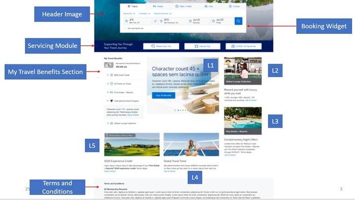
Before of the US Homepage Design

-
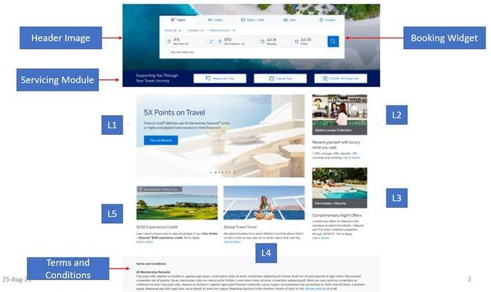
Before of the UK Homepage Design

Although the current homepage was performing exceptionality well, the client had produced a list of features and requirements that the latest experiences would not support without breaking the design UI. Instead, our team proposed a better solution to uplift the current designs and create a new content hierarchy. This allowed our team to explore flexible design solutions to be tested with new product requirements that can continue to grow as the tech and travel sectors evolve.
The Kickoff Phase
To kick things off, below is a list of existing features on the homepage and some new features that the client wanted in the latest designs.
Guiding Principles
Benefit Driven
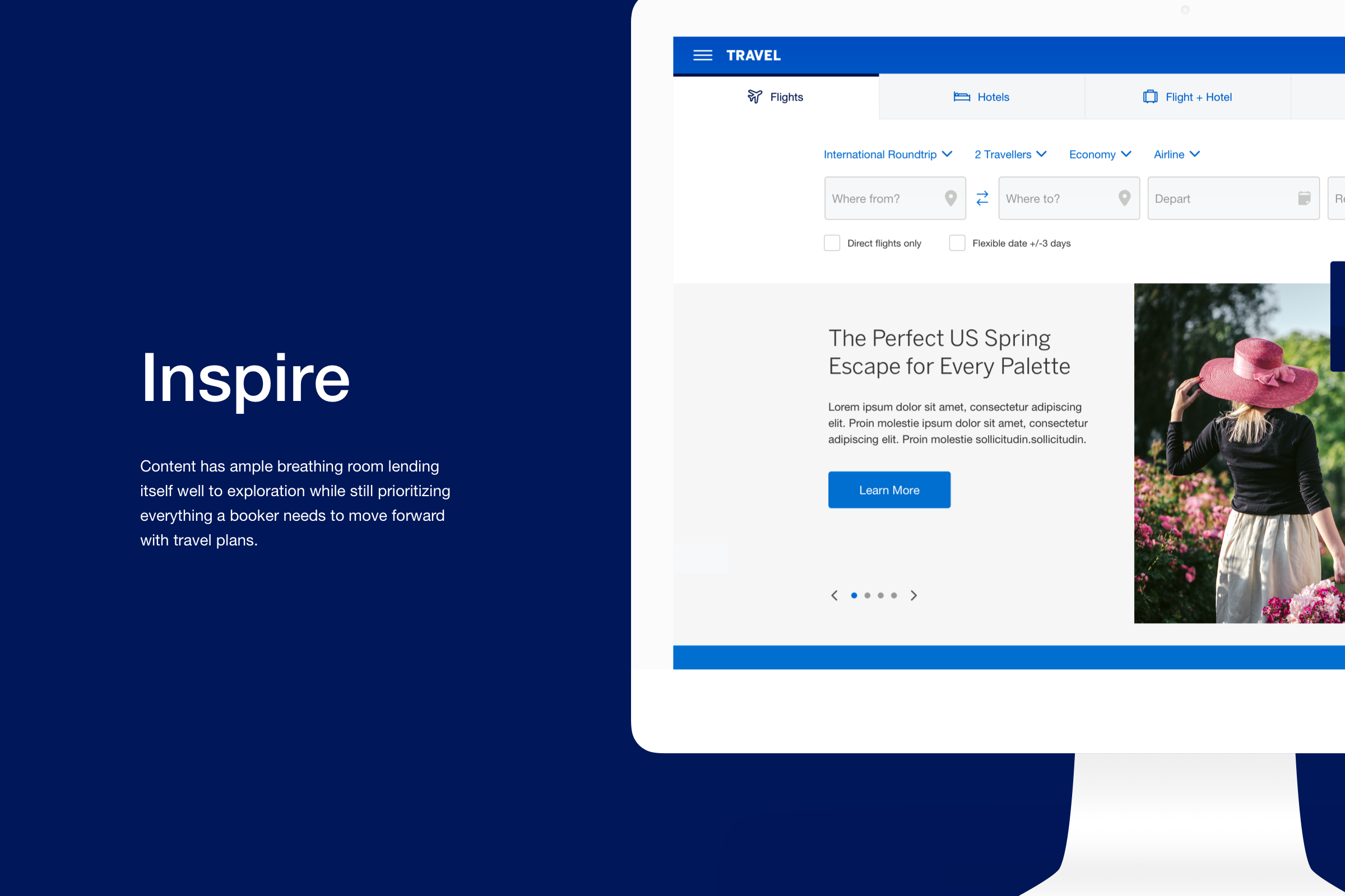
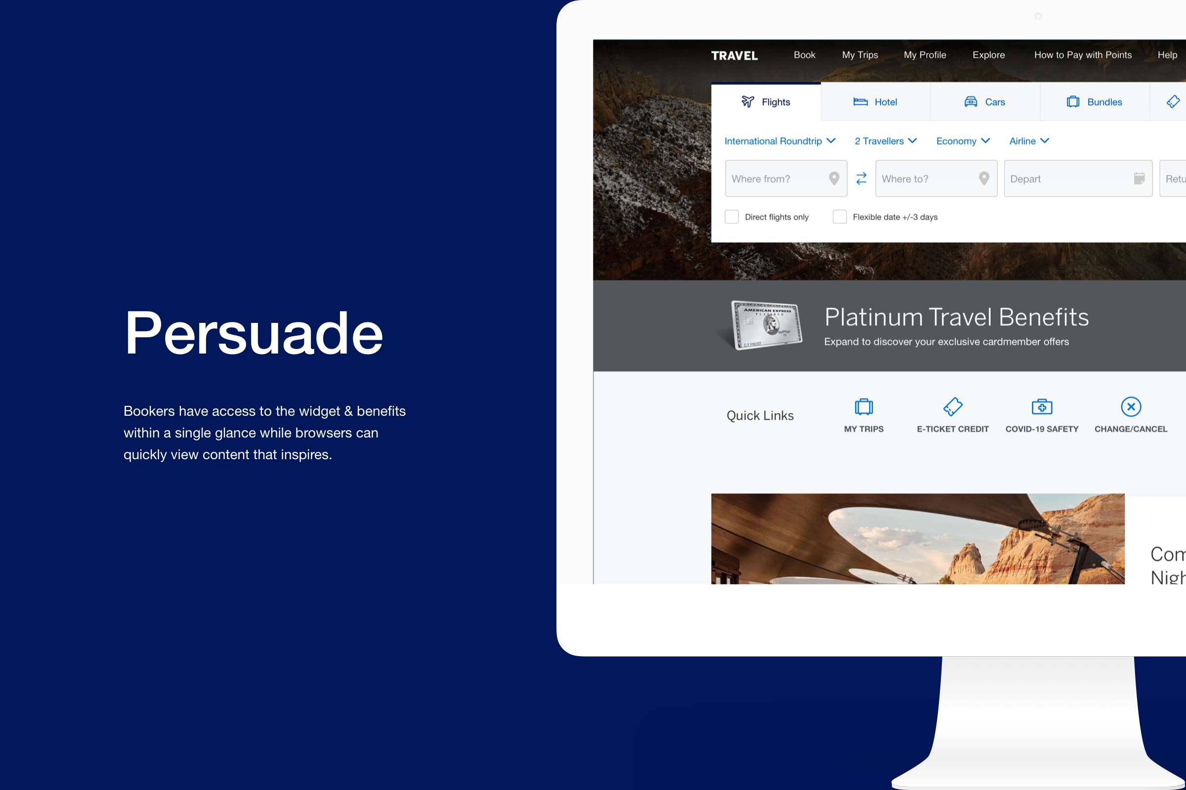
The premium travel loyalty offerings separate American Express Travel from other OTA competitors. The new homepage redesign will be the introduction to educate and engage card-members about their travel benefits.
Go Beyond Booking
Design should inspire, be fun, and be engaging—introduced personalization by encouraging exploration of destinations via inspirational content, showcasing the breadth of travel through hotel theme-based interests.
Speed To Market
Develop a ship-to-market strategy with efficiency and speed by creating a flexible homepage that is adaptable to today’s technology with the ability to continue to add additional features and enhancements.
Competitive Analysis Overview
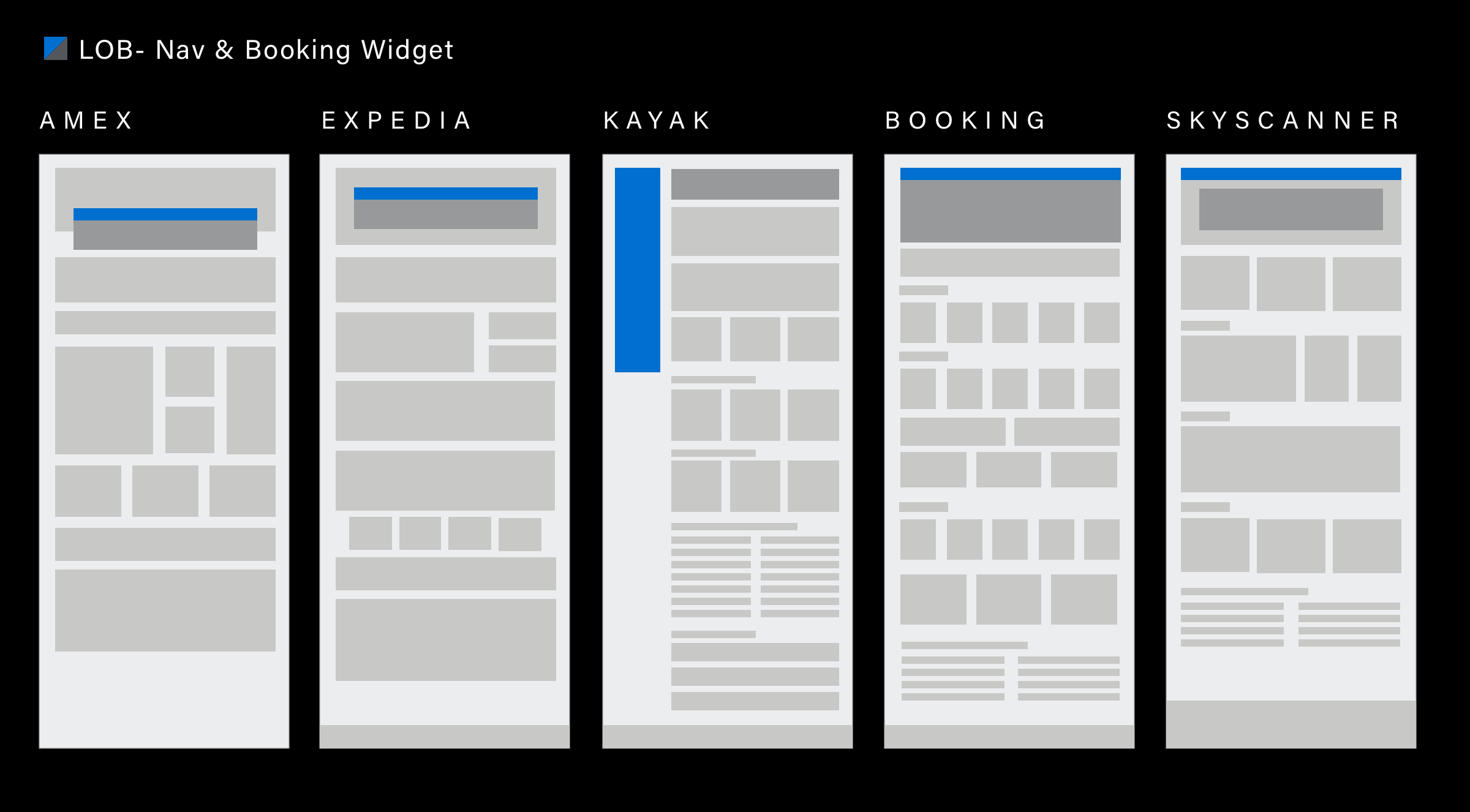
Our initial starting point was researching the competitive landscape to uncover industry standards.
Competitive Analysis
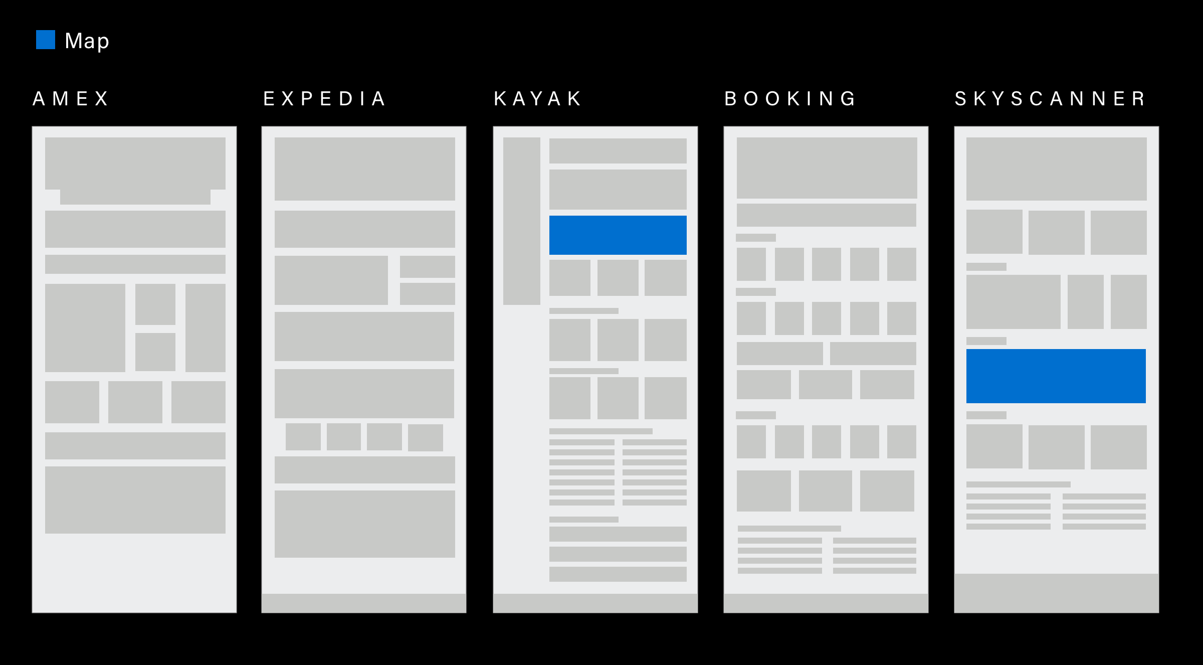
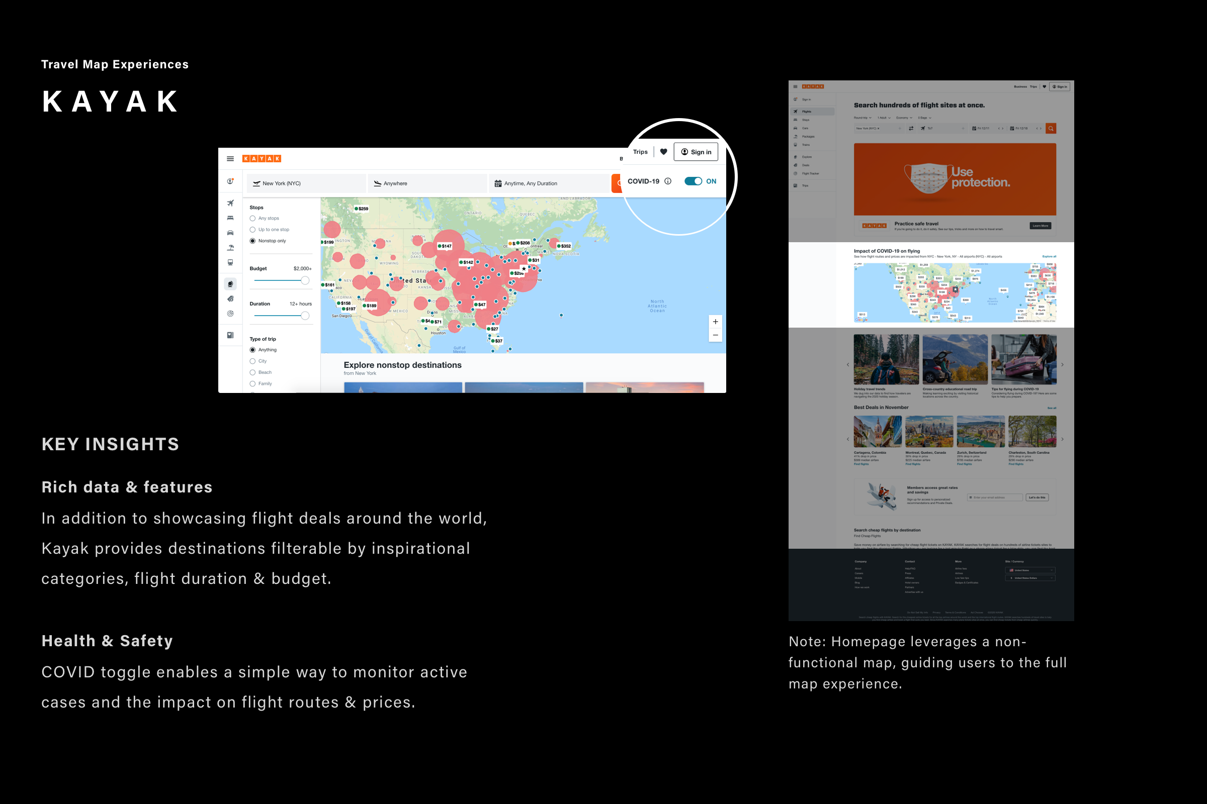
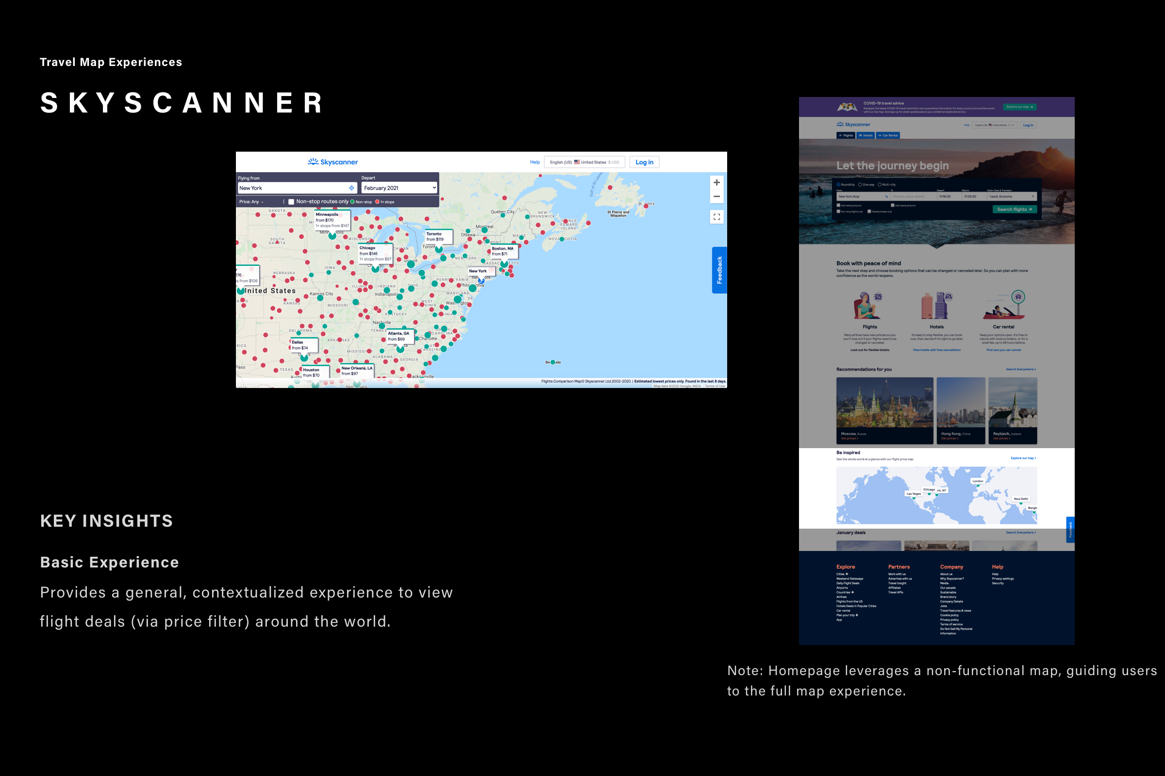
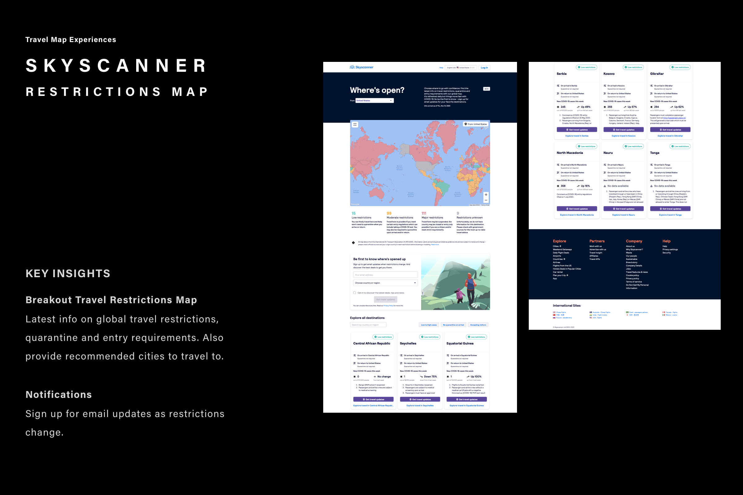
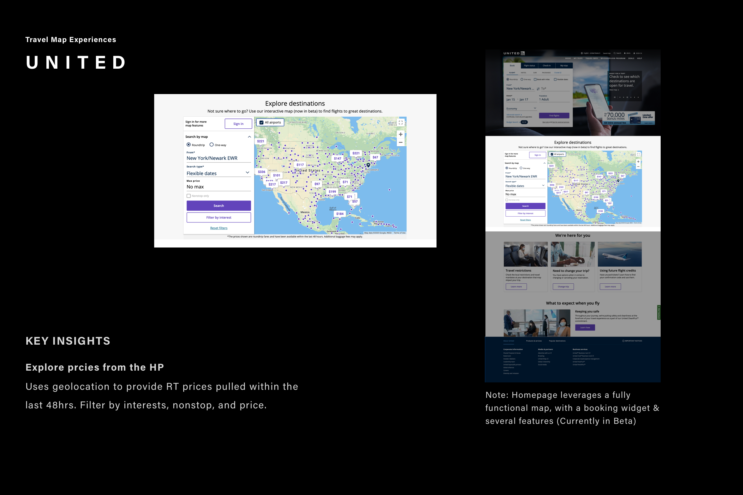
Maps

Competitive Analysis
Navigation
KAYAK
Content is King
Leverage an expand/collapse side navigation to surface more content above the folds.
From Site to Web App
A modern Nav design can give standard websites a web app look and a smoother transition to a real web application implementation.
66 Nord
Primary Navigation -Dropdown
Full-screen takeover offers an immersive experience to bring more categories to the forefront.
Competitive Analysis
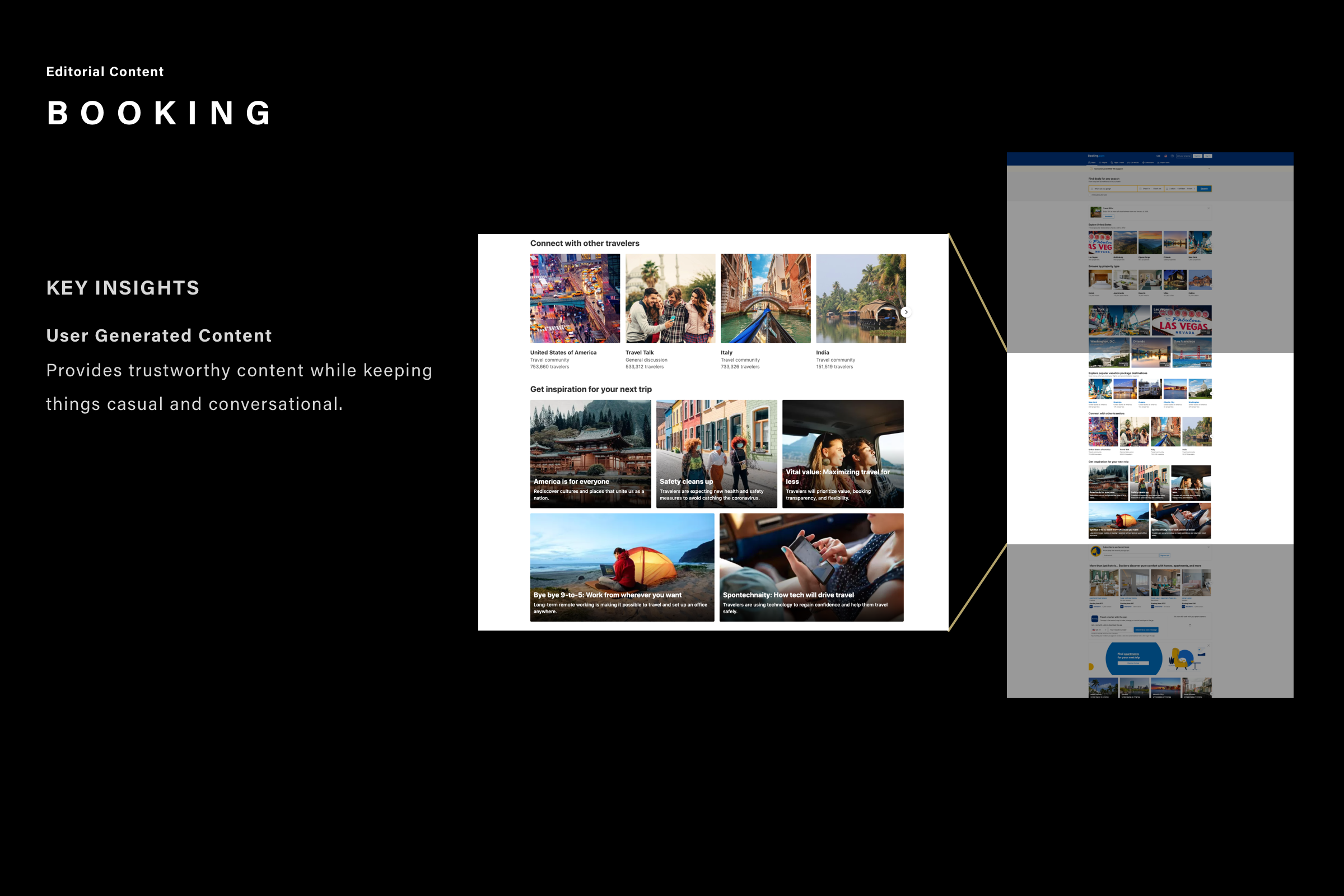
Editorial Content
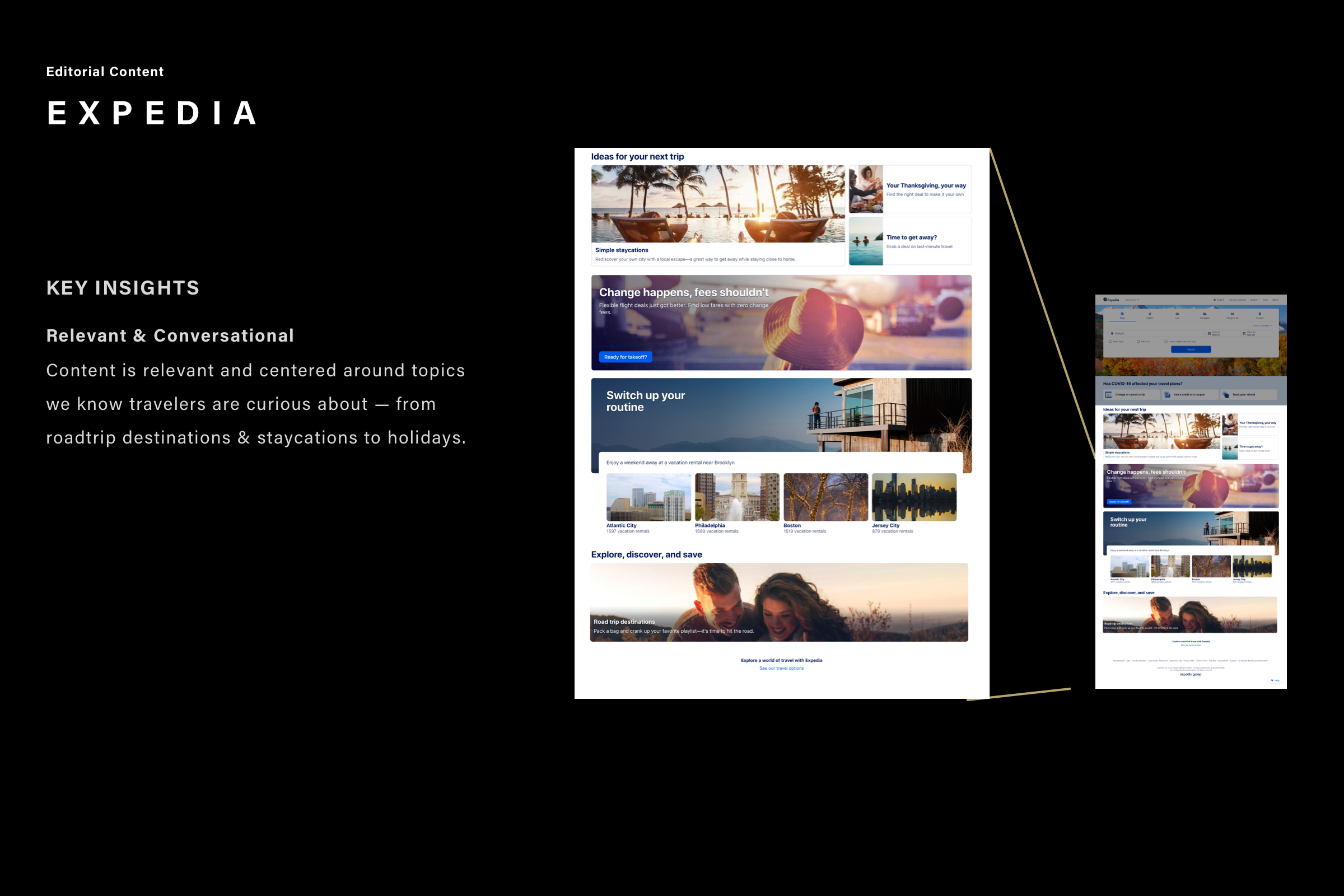
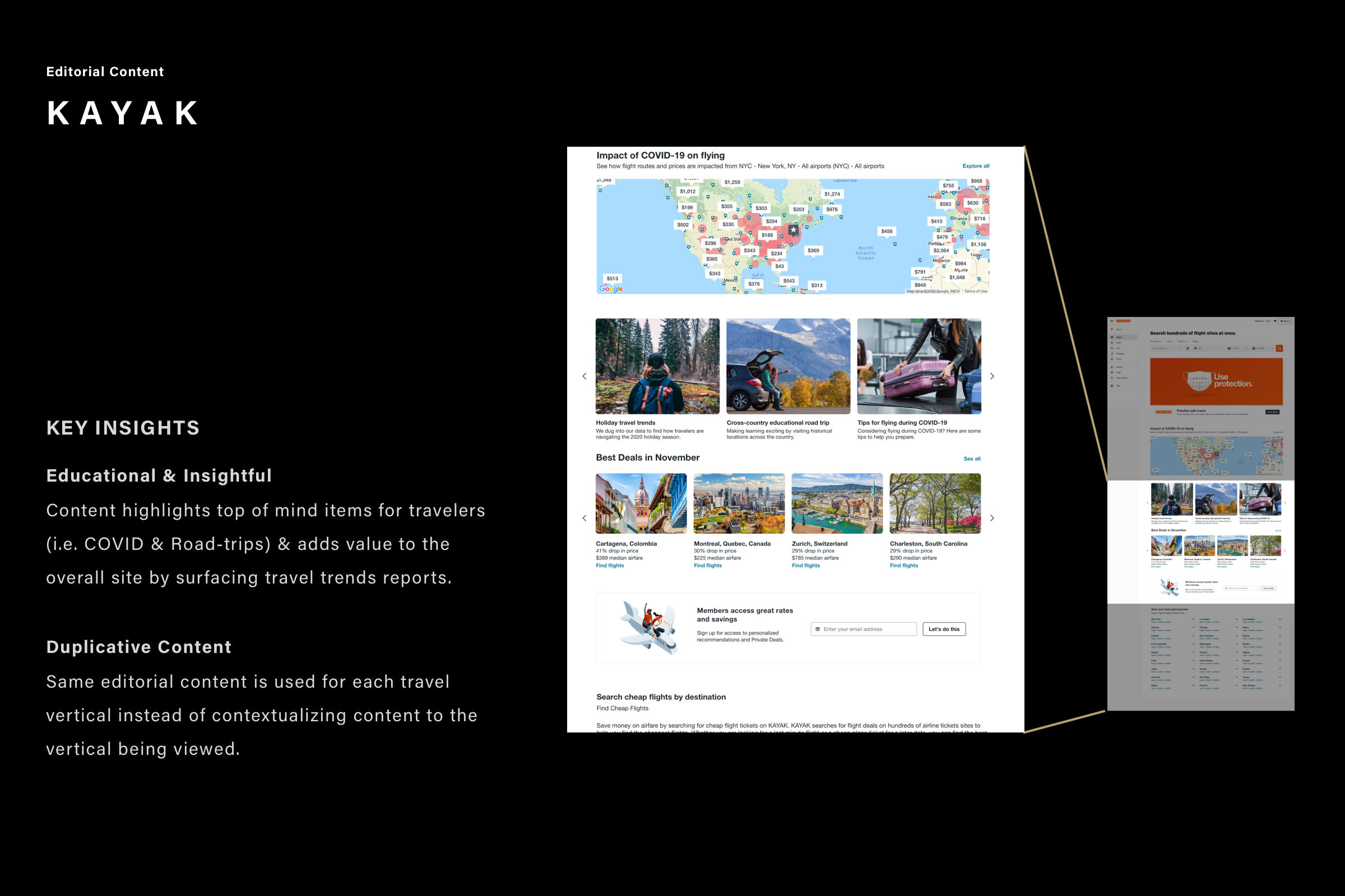
Key Takeaways
Map
Link to the full map experience from the homepage to avoid information overload and improved load times.Consider two map experiences: One that contextualizes flight deals based on the rate of infection & another for high-level country/state travel restrictions.
Navigation
Vertical navigation schemas are great when trying to re-allocate prime real estate to content & give a website a more modern web app feel.Break-away from the conventional primary nav dropdown by creating a full-screen modal to give users an immersive experience for secondary nav items.
Editorial Content
Keep content conversational vs. transactional.Contextualize content by leveraging travel vertical tabs to surface information relevant to that space.
The Workshop Phase
Based on our competitive analysis and list of requirements, my design team put together a few ideas and high-fidelity designs to facilitate the upcoming brainstorming session ahead of the workshop. Later the workshop session was held with key partners to discuss features and the core functionality essential to the homepage redesign. Because we were working from home we used digital tools like Miro and Freehand to facilitate our remote working sessions.
Module Sorting Exercises
After the workshop, the Amex product and marketing teams met to align the design hierarchy for the homepage. Unfortunately, they were not able to determine the order for all scenarios. The good news was that our team leveraged the Amex international testing team and suggested a module sorting exercise as the next step to help move this along.
Our team provided mock-up modules of each of the homepage elements (see designs below)
Amex had its customers perform a sorting exercise to define the hierarchy based on usefulness.
And allow cardmembers to remove irrelevant modules options from the homepage.
Homepage list of sorting content
-
Unused Credits
List of airline credits for flights that were previously booked but canceled. Users can apply these credits towards their next flight.
-
Reserve Rates
After a user book a flight, discounted hotel rates (within their flight destination) are presented to help complete their trip. For example, a user with an upcoming flight to Miami will see a list of discounted hotels in Miami.
-
Upcoming Trips
Snapshot of the users' next trip. Clicking on the "View Details" link drives to a page with the full trip details.
-
Benefits
List of 3 benefits that the user is eligible for when booking with American Express Travel.
-
Hero
Background image for the homepage.
-
Booking widget
The tool is used to enter and search for a travel destination (ex: a flight, hotel, car, etc).
-
Marketing Tiles
The tiles are used to promote travel sales or drive awareness about American Express Travel benefits.
-
Feature Hotels
Marketing tiles with specific hotel details, such as the property name, promotional rates, and American Express hotel programs such as Fine Hotels and Resort.
-
COVID Servicing Module
List of quick links that drive to pages where users can change or cancel their trips or get information about travel restrictions.
-
Recent Searches
List of recently searched hotels, flights, or cars. When the user clicks on this link, they are directed to a page with details about the specific hotel, flight options, etc.
-
Map
Map diagram with callouts for airfares by region. Clicking on the map drives to a page that allows users to search by price.
-
New Overlay
Module with personalized messaging is used to either encourage a user to book or log into their account.
-
Cross-sell (Personalization)
Tiles are used to encourage users to book hotels, flights, cars, or cruises.
-
Membership Rewards Balance
Tiles are used to display users’ membership rewards points and how they can be applied for travel.
-
Travel Credit
Messaging of $200 credit that can be applied towards the users’ next booking.
The Design Phase
Below displays, a few design concepts of the homepage based on insights gathered from in-depth research interviews conducted on 12 Platinum/Gold cardmembers. The general synopsis of the card sorting exercises was less about creating a content hierarchy but that American Express Travel had to prioritize two primary users, a booker, and a browser.
The research shareout was prescriptive about which elements were above or below the fold for bookers vs. browsers. We found creative solutions that strike a balance that satisfies both booker & browser experiences. Modules within both versions are interchangeable.
Bookers
Purpose in approach; the goal is to choose and book-specific flight/hotel/package. Need content that persuades them to use TLS to make their booking easy.
Browsers
Approach travel sites with an open mind; the goal is to explore. Need content that inspires them to book (deals/offers).
Option 1 - Inspire
Option 2 - Persuade
Phase 1 - Create two design directions based on the user testing feedback.
Pause and Remind
At this phase, the project was losing steam with internal politics about product hierarchy and placement. Before going head-down in the design phase, re-alignment with both teams needed to occur. We did a quick design exercise to help the client visualize the current homepage with all the new features in the existing designs. The update helped the client visualize how important it was to push for a brand new design and not fall back to the current homepage structure.
Teams aligned that the new POA Homepage must include the following featured content
Unused Credits
Reserve Rates
Upcoming Trips
Covid Messaging
Platinum Card Benefits
IF/AIP/Reco Flights
Favorites
Room for Marketing Content
Widget Area
Try not to redesign the widget - this area is performing well.
However, that does not mean that a new location can be explored.
Phase 2 - Design for POA and MVP
After the re-alignment, the teams were back on track. We propose to design for POA, with the all feature wishlist. Planning for POA would allow the client to visualize the end product. This strategy permitted both the design/development teams to continue to work without going in circles of adding and removing features.
Once, the client and the development team choose the final POA direction, the design team was ready to create the MVP
Next steps include the following feedback in the design explorations.
1. Top - Booking widget area
• Explore color blocking or image behind the booking widget.
• Header above the widget
• Anchor link driving CMs to program benefits.
• Visual exploration of personalized self-service section.
.
2. Core - Marketing content & cardmember benefits
• Visual exploration removing heavy UI elements to clean up section.
• Personalized content within modules and contextualized program benefits to the booking tab.
3. Mobile designs
Design for mobile and tablet.
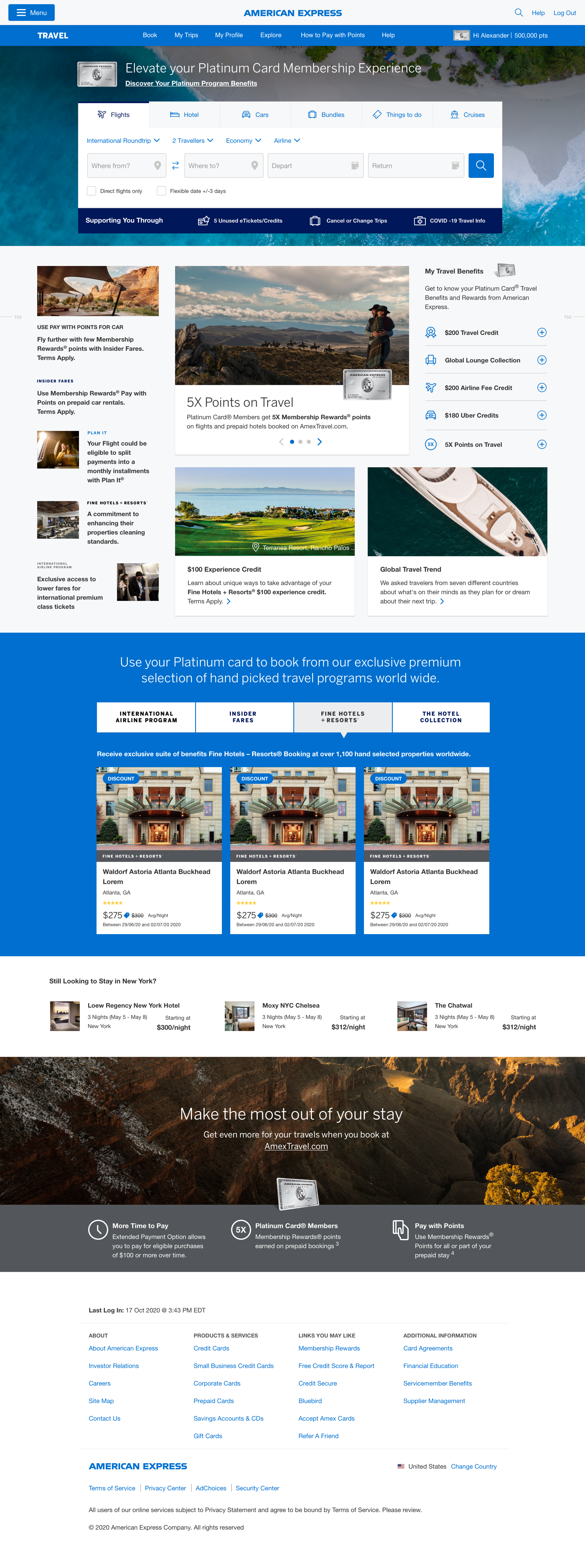
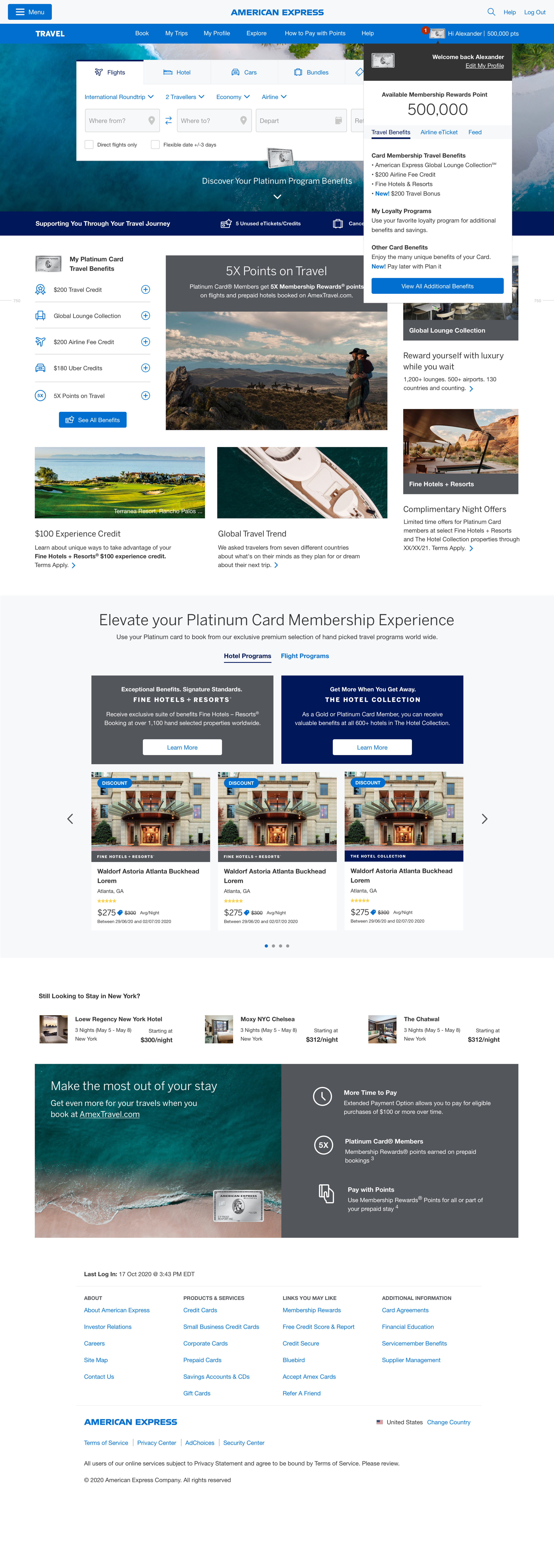


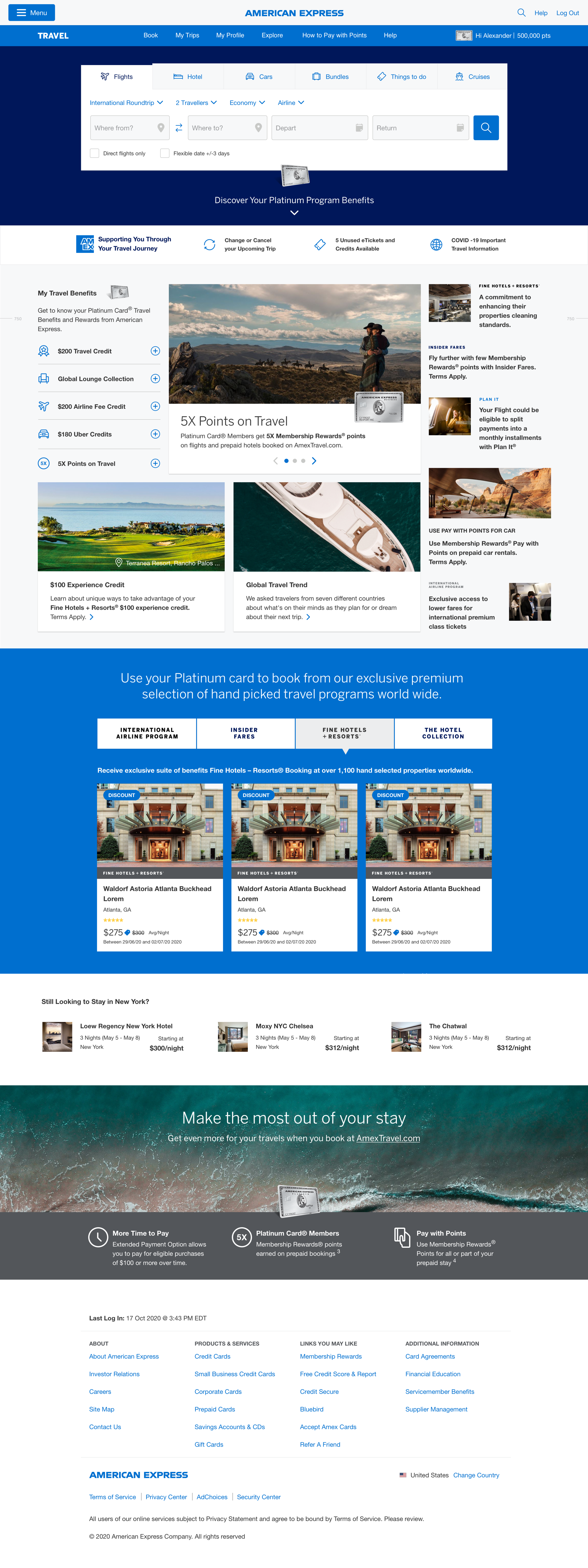

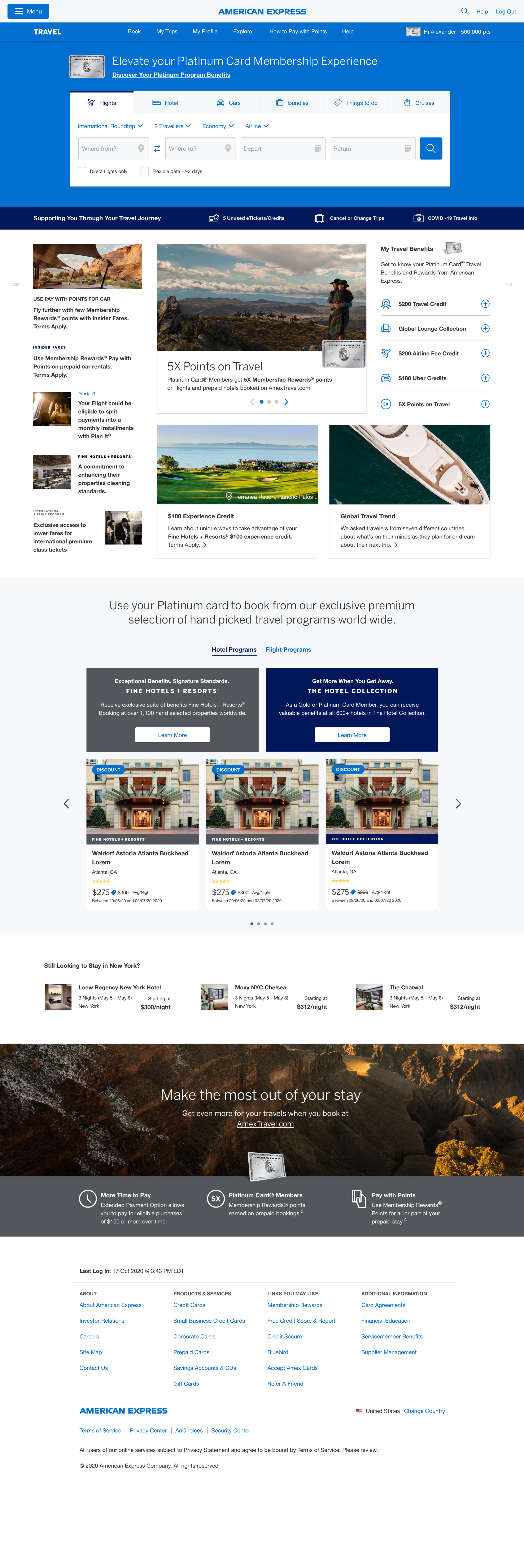

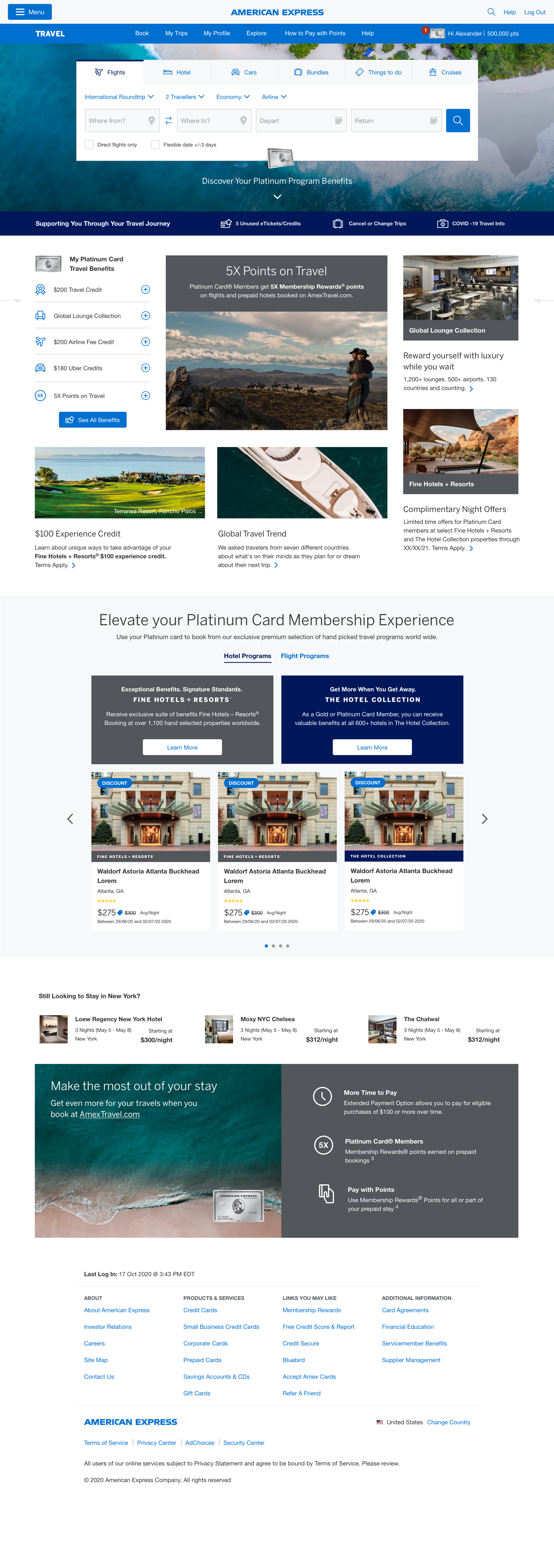
Phase 3 - Design for MVP
The Handoff Phase
The team finally enters the long stretch; we have internal alignment to create the absent UI states and studies for the homepage MVP launch. Like the different card types, logged in and logged out experiences, and designs for all mobile devices.
